Love them or hate them, Excel charts have always been a key feature. They’re a powerful way to visualize data, communicate trends, and highlight anomalies.
Excel 2016 has taken charts to a whole new level by adding several charts that users have been requesting for many years!
Here’s a quick tour of the top 3 new charts.
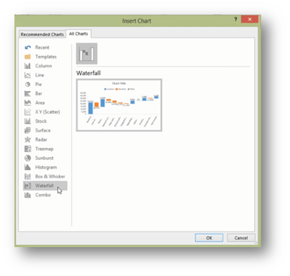
1. Waterfall Charts
… Finally! (how many years have people been asking for this one?)
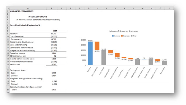
These type of charts are a great way to show a starting point, positive/negative movements and the ending point that results.
This chart also allows for subtotals along the way.
For example, they’re often used to show things like Profit & Loss Statements (Income Statements) where you have revenue, cost of goods sold, Gross Profit (sub-total), overhead expenses, operating income (subtotal), other income, earnings before tax (EBT), income tax, and net income.
They could also be used for cash flow statements, project forecasts or to reconcile the current year’s results to the previous year’s.
2. Treemap
To chart data from hierarchies and visualize how one element and category compares to the others.
In this example, we have car manufacturers and car models together with their sales.
Trying to put all this data into a pie chart is problematic: it’s just too hard to see what’s actually going on.
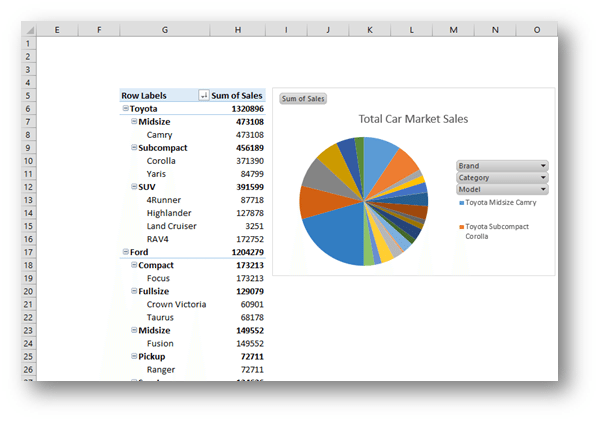
But taking the same data and putting it into a Treemap, makes it much easier to understand.
You can easily see that in our sample data, Toyota and Ford have nearly 50% of the market share, and that the Camry model makes up the biggest chunk of Toyota’s sales.
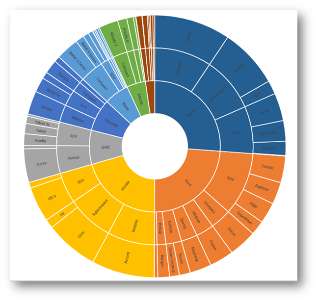
3. Sunburst
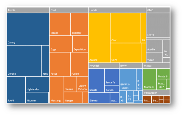
Another really useful way to visualize hierarchies (like our car sales example above) is to use a Sunburst chart.
This works particularly well when you have more than 2 levels.
In this example, we’ve taken the car sales and broken them down into manufacturer, car type, and car models.
The Sunburst chart is perfect for visualizing this data.
But wait, there’s more …
There are some other new ones too:
- Histogram (for statistical analysis)
- Box & Whisker (for showing data and the distribution of results)
- Pareto (the very principle we’ve followed here to just bring you the best ones!)
Upgrade to 2016 or Office 365!
So get ready to upgrade because there are also some other really cool features you’re going to want to make use of too.
Don’t leave it until 2023!


