How to Create Interactive Infographics
By Jeff Robson
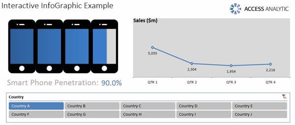
Normally InfoGraphics are just static PDFs … but wouldn’t it be great if they were a bit more useful and you could change them to see the specific things you’re interested in?
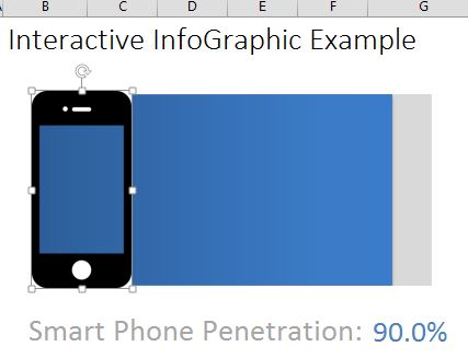
This example lets you choose a Country, then this updates the Smart Phone Penetration % number as well as the chart above, plus it also shows the year’s sales in the line chart.
Here’s how we did it
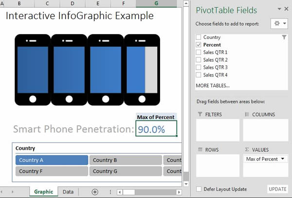
Start by putting all your data into a table (Ctrl-T). then click summarize with Pivot Table & set up your first Pivot Table as shown. This will generate the Smart Phone Penetration percentage number. Hide the “Max of Percent” row.
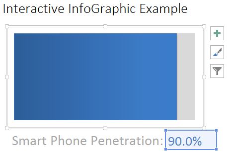
Insert a 2D Bar Chart that’s based on the Max of Percent number & apply formatting.
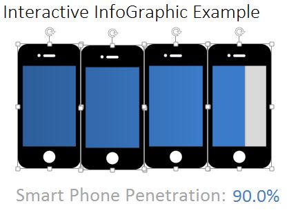
Next, insert an image that has at least one part that’s transparent (e.g. a GIF or PNG image file). If you’re not sure what this means, speak to you graphic designer & they can do this for you in about 5 min using Photoshop or Gimp (free).
Place this over your bar chart.
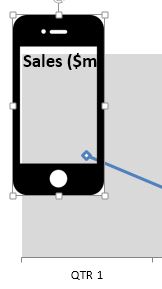
Copy & paste the image until it covers the area of your bar chart, then select all the images and line them up via Format > Align > Align Top.
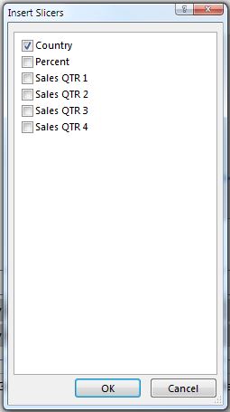
Insert a Slicer (Excel 2010+ only) by clicking on the penetration percentage then going to Pivot Table Tools > Analyze > Insert Slicer
You should now have an interactive, very cool chart that all your friends will ask “How did you make this?”
(this is when you refer them to Access Analytic’s website!)
The second chart is just a simple line chart based on a second Pivot Table that’s linked to the Country slicer. The actual pivot table is hidden behind the chart itself
Take a look at the Excel file to see more.

