Mastering Dynamic Measure Formatting in Power BI | Part 4: Dynamic Formatting Based on Value Ranges
By Melina Louzada
You’ve made it to the final part of our blog series on mastering dynamic measure formatting in Power BI! If you’re joining us now, you can catch up with Part 1 here, Part 2 here, and Part 3 here. In this post, we’ll explore dynamic formatting based on value ranges, a method particularly useful for measures spanning a vast range of values.
This approach uses the SWITCH() function to apply different formats based on predefined value thresholds, enhancing readability.
Step-by-Step Guide:
- Ensure you have downloaded the working file provided in the Part 1 of this series.
- Select the “FormattedTotalSales” existing measure.
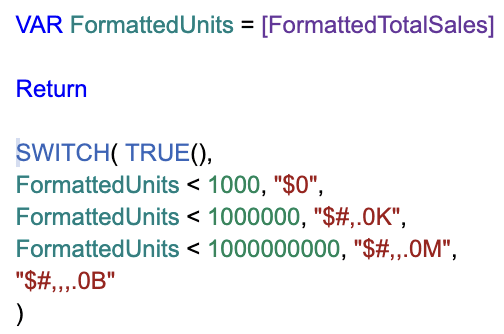
- Use SWITCH() to define formatting thresholds. The following DAX snippet illustrates this concept:
-
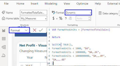
- Select the measure and change Format to Dynamic.

- Select the measure and change Format to Dynamic.
-
- With “Format” option selected, type the following in the formula bar

- With “Format” option selected, type the following in the formula bar
- Your visuals should appear as below, showing values not formatted and with conditional formatting applied.
-
Pros and Cons
Pros:
- Straightforward to implement for a single measure
- Great for dealing with a wide range of values
Cons:
- Not as scalable for multiple measures
- Each new measure requires a separate DAX formula
Applications
This option is particularly useful for summary measures in dashboards, where values can vary greatly depending on the data slice.
Concluding Thoughts
Thank you for following our 4-part series on dynamic measure formatting in Power BI! We’ve explored various techniques, from static visual-level formats to dynamic value-based approaches. Experiment with these methods to find what works best for your reports.
Dynamic measure formatting in Power BI can dramatically improve the usability and clarity of your reports. Whether you choose to use SWITCH functions, individual visual formatting or value range-based formatting, each method has its place in the Power BI toolbox.
We encourage you to experiment with these techniques, you can check the tab “End” in the working file provided to see them in action. Note it contains the results from all 4 blog posts. Remember, the best way to learn is by doing, so don’t hesitate to get your hands dirty with.
If you missed any parts of this blog series, check out Part 1 here, Part 2 here, and Part 3 here. Keep exploring Power BI to make the most out of your data!


