Mastering Dynamic Measure Formatting in Power BI |Part 3: Using SWITCH/SELECTEDVALUE() for Dynamic Formatting
By Melina Louzada
Welcome to the third blog in our series on dynamic measure formatting in Power BI! If you haven’t checked out the first two blogs yet, find Part 1 here and Part 2 here. This post will cover using SWITCH() and SELECTEDVALUE() functions to create more advanced dynamic formatting options.
The SWITCH() and SELECTEDVALUE() functions in DAX are powerful tools for conditionally formatting measures. By creating a two-column table for measure names and formats, you can apply specific formatting directly within a Matrix visual.
Step-by-Step Guide:
-
- Ensure you have downloaded the working file provided in the Part 1 of this series to follow along.
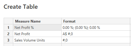
- Create a new table with columns for ‘Measure Name’ and ‘Format’.
-
- On the Home Menu, click on Enter data

- On the Home Menu, click on Enter data
-
- Give your new table a name. i.e. MyMeasures Formatting

- Give your new table a name. i.e. MyMeasures Formatting
- Enter values on table as per below, ensure to name the columns too (double click to edit the column name). Note you can add different formatting for positive, negative and zero values by separating with a semi-colon.Positive ; Negative ; Zero

-
- Create a new measure using the SWITCH() function to assign the formatting based on the measure selected. Here’s an example of what your DAX formula might look like:

-
- With the measure selected, change the Format to Dynamic and type on the formula bar
SELECTEDVALUE( MyMeasuresFormatting[Format] )

- With the measure selected, change the Format to Dynamic and type on the formula bar
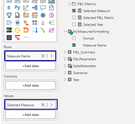
- Create a new Table Matrix Visual and add the Column “Measure Name” to the rows and your new measure “Selected Measure” to the values section of your visual.

-
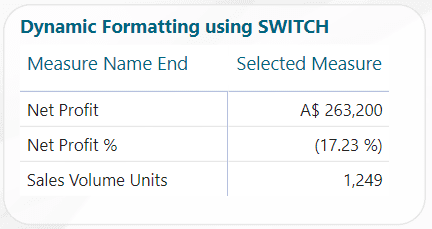
Your table should look like this

Pros and Cons
Pros:
- Flexibility to define custom formats for each measure
- Simple to implement for a few measures
Cons:
- Can become complex and unwieldy with a large number of measures
Applications
This approach is ideal for reports where a handful of measures require unique formatting that deviates from the standard.
Next in the Series
We invite you to try out these techniques yourself. You can view their implementation in the “End” tab of the working file provided, which includes the outcomes from all four blog posts.
Don’t miss the final part of this series, Part 4: Dynamic Formatting Based on Value Ranges, where we’ll learn how to apply dynamic formatting based on value thresholds. For those just joining, find Part 1 here and Part 2 here.


