Create a Waterfall Chart
by Yury Tokarev
A waterfall chart is a great way to represent financial inflows and outflows. Yet, it is a daunting task to create this in Excel versions up to 2013 (see links below for help!).
The good news is that Excel 2016 has taken all the complexity away. Below we show how to produce Waterfall in three easy steps.
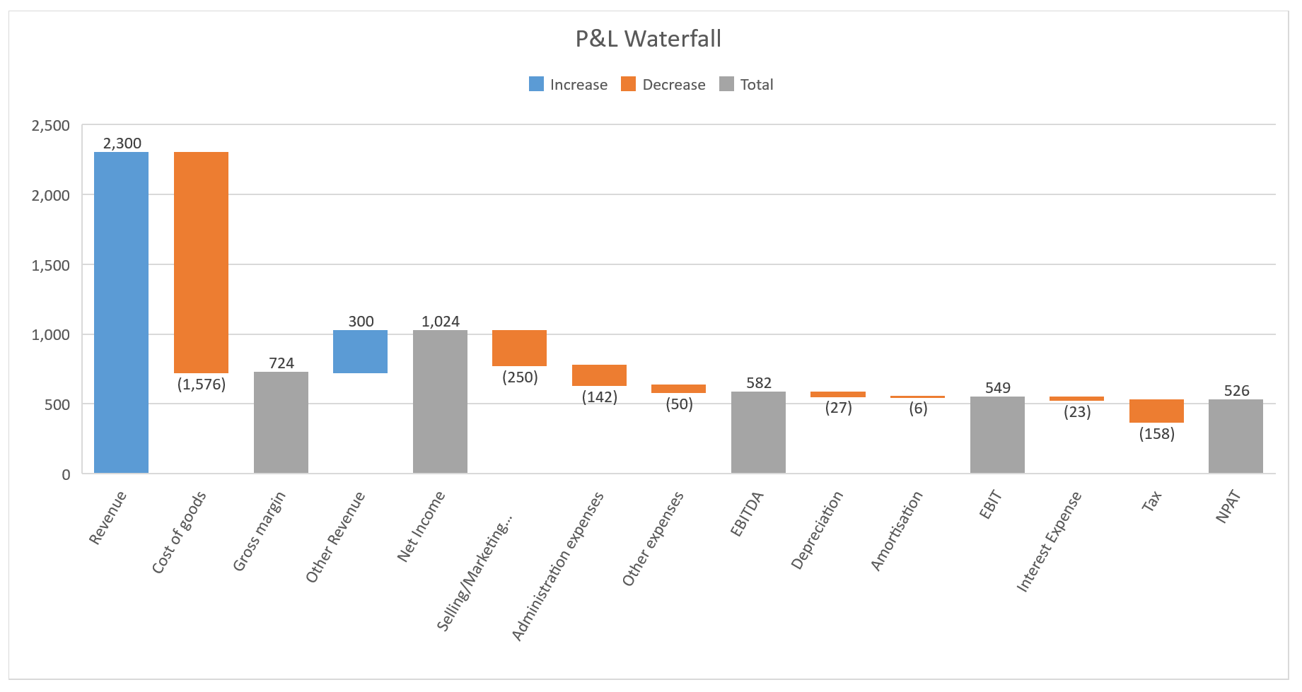
Here is how the final product looks…

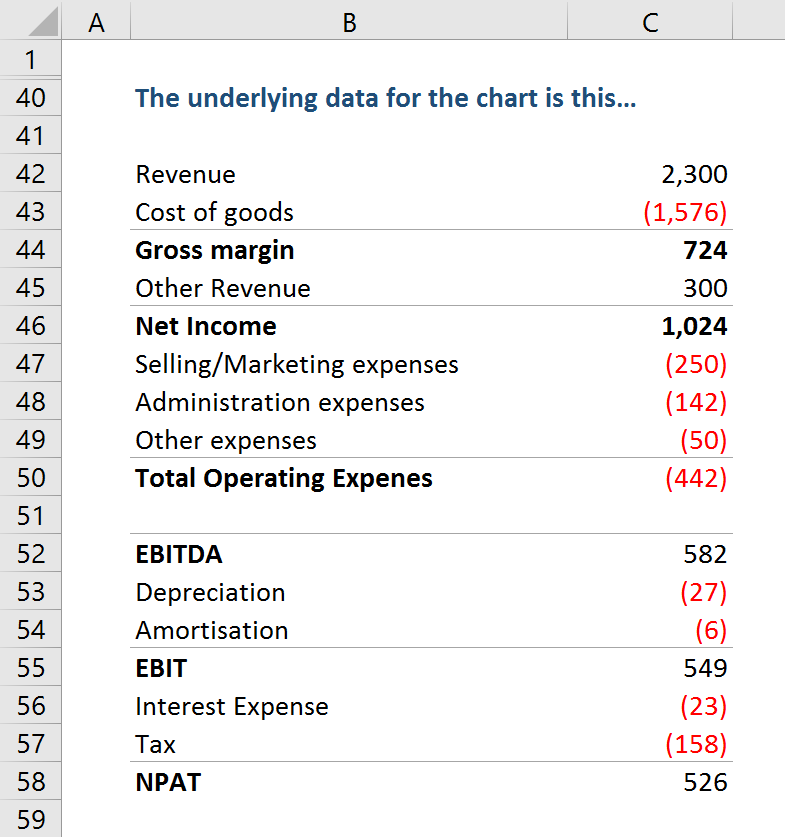
The underlying data for the chart is this…

And here are the 3 steps to replicate the chart…
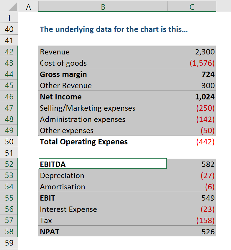
Step 1: Select Ranges
While holding ‘Ctrl’ button select (multiple) ranges B42:C49, B52:C58. The multiple range selection is required to exclude ‘Total Operating Expenses’ line from the graph, as we do not want to show it.

Step 2: Insert Waterfall Chart
Go to Insert/Charts menu, click on Waterfall chart icon and then select ‘Waterfall’

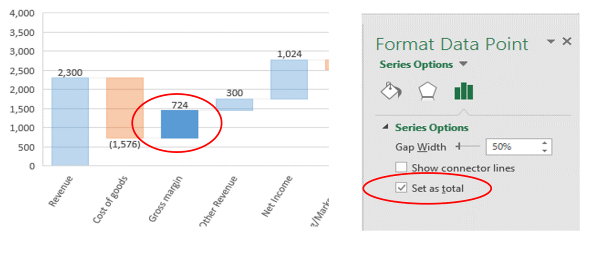
Step 3: Set total columns
Click twice the “Gross margin” bar on the chart to select it individually. Then right click and select “Format Data Point” from the context menu. This will display “Format Data Point” menu. On this menu select “Series Options”, then tick the box “Set as total”. Repeat this step for “Net Income”, “EBITDA”, “EBIT” and “NPAT”.

Frustrated with spreadsheets?
You will be amazed by how we can help!
To find out more, contact Yury +61 423 588 212 or leave your details below
ytokarev@accessanalytic.com.au


