Apologies for the Dad joke above (not really), but in this article, I’ll show you how you can easily get data labels on all your data series, even if you have LOTS. All it takes is a little VBA code.
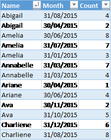
In the data set below, I’ve made up some stats about how many girls were born at our imaginary hospital over a period of time, and what their names were … mainly because I feel this data completely justifies my continued use of very bad dad jokes!

Anyway, let’s assume you want to chart the individual names, plus you want to know the total each month.
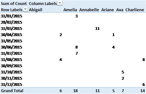
That’s easy enough to do … you just put this into a pivot table & generate your desired chart.

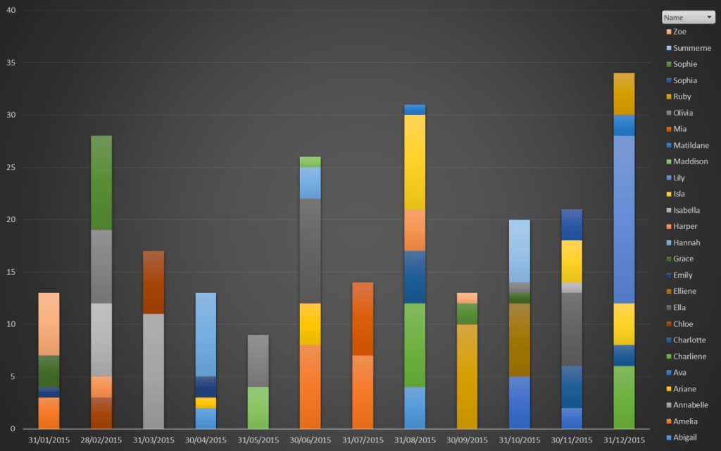
The resulting chart wouldn’t be too bad if we only had 4-5 names, but what if we have 20-30 names?
It’s a bit hard to match the legend colour to the column colour.

One solution could be to add a data label … but with so many data series, the girls would be teenagers by the time you finish!
A Macro Solution to a Micro Problem
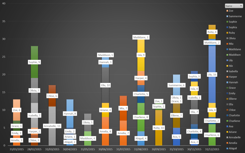
The solution here is to use a VBA macro to automatically create all the data labels we want to see.
This is the 2013 version – see the file below for one that works in 2010. We also set this up to run every time someone clicks on the Report sheet so that it is constantly refreshed.
While the result is slightly different in 2010 since it lacks some of the nice new features in 2013, the result is mostly the same.

… and now if the image were big enough, you’d be able to read all the names plus they’d stay in sync with any new data you add! Voila!
Download template Data Labels Series Names 2010 or Data Labels Series Names 2013.


