Mastering Dynamic Measure Formatting in Power BI | Part 2: Dynamic Cell Colour Formatting
By Melina Louzada
Welcome back to the second part of our series on mastering dynamic measure formatting in Power BI! If you missed Part 1: Flexibility with Visual Level Format String, you can check it out here and download the working file. In this post, we will dive into dynamic cell color formatting, a great technique for enhancing the visual presentation of your data.
Dynamic cell color formatting uses a DAX measure to change cell colors based on values dynamically. This technique helps in highlighting trends and drawing attention to significant data points.
To illustrate this, we will enhance the visual presentation of our net profit data, you can use a DAX measure to dynamically format cell colors based on positive or negative values.
Step-by-Step Guide:
-
- Ensure you have downloaded the working file provided in the Part 1 of this series.
- Add a measure to define the Colour based on the value of an expression.

-
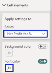
- Select Visual “Net Profit – Add Colour Measure on Variance”, then on the Format Pane, go to “Cell elements”, select “Net Profit Var %” measure as the “Series” and toggle Font Color ON and click on the “FX” symbol

- Select Visual “Net Profit – Add Colour Measure on Variance”, then on the Format Pane, go to “Cell elements”, select “Net Profit Var %” measure as the “Series” and toggle Font Color ON and click on the “FX” symbol
- Select Field Value and for the field, select the new colour measure created on previous step.

Your table should now look like this, by changing the year filter, you can see the colour measure being applied.

Pros and Cons
Pros
- Enhanced data visualisation making it easier for users to interpret data trends at a glance.
- Easier to replicate and maintain across different measures than individually selecting the colours based on the measure values using the standard method provided in the visual.
Cons:
- Can become complex with a large number of measures
- Limited to visual-level customisation, it doesn’t affect the other visuals without reapplying the same method.
- Conditional formatting using measures could slow down report performance, particularly with complex or large datasets.
- Only controls colours formatting.
- Requires a basic understanding of DAX
Applications
This approach is great to dynamically highlight specific elements of a visual that require further attention. i.e. once a trigger is reached, if values are negative, to categorise values in colour coding.
Next in the Series
Feel free to experiment with these techniques. For a practical example, refer to the “End” tab in the provided working file, where you will find the results from all four blog posts showcased together.
Up next is Part 3: Using SWITCH/SELECTEDVALUE() for Dynamic Formatting, where we’ll cover more advanced dynamic formatting techniques using DAX! If you missed Part 1, catch up here.


