By Wyn Hopkins
 If you find the default Icon settings confusing in both Excel and Power BI, you’re not alone!
In July 2019 conditional formatting Icon Sets were added to Power BI and it caused us to revisit how they work in Excel.
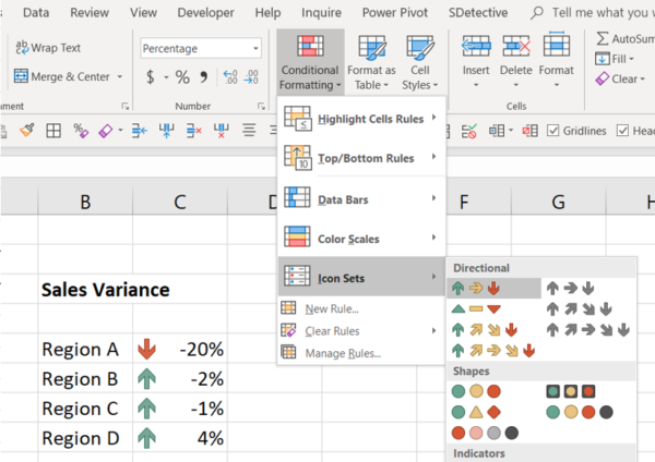
In Excel you would highlight a range of numbers and choose Conditional Formatting : Icon sets. But you’d get odd results such as in the screenshot where negative numbers have up arrows.
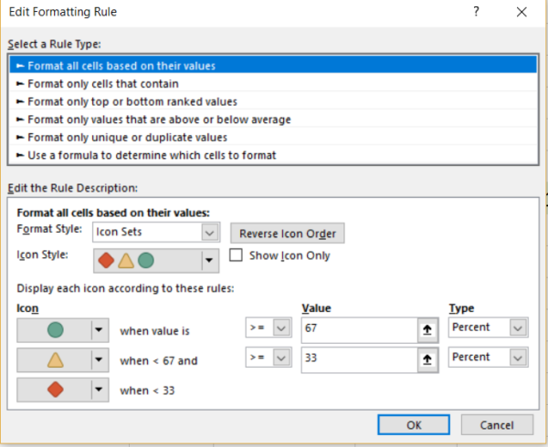
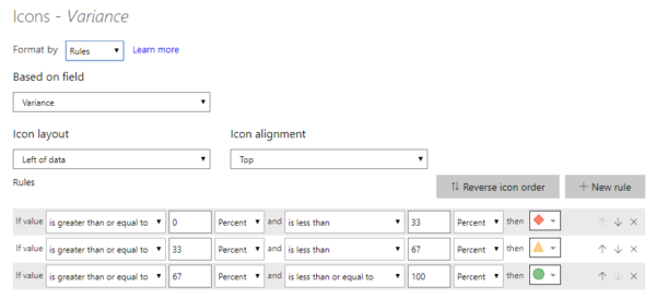
This happens because the default option is set with the values split into 3 groups of the lowest 33%, middle 33% and upper 33%.
The Maths (for those number junkies out there)
To see how the calculation actually works, take a look at this example (thanks to fellow MVP Tim Heng for setting us straight on this)
So using the Min and Max of the selected values (A5:A8) the Total Difference between this Min and Max is calculated (e.g. 9 in the left hand side example)
Then the difference between the value being considered (e.g. cell A7 contains 4) and the Min (1) is calculated giving 3 and finally that is expressed as a % of the total difference = 3/9 = 33.33% which sneeks over the 33% threshold and the icon in A7 turns yellow.
In the right hand image the max number in E5:E8 is 11 therefore the difference is 10. Then looking at a particular value say E7 we have the number 4. So 4 minus the min of 1 is 3 and then 3 /10 = 30% which falls bellow the 33% threshold and the icon is Red.
This default setting generally isn’t useful and we always change it to something more practical
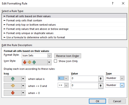
Our process is to click on Manage Rules and change the rules to something to control more directly by switching the Type (down the bottom right of the image) to Number instead of Percent
Power BI
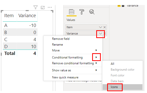
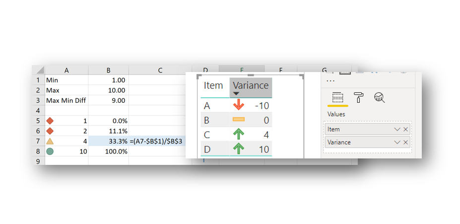
A similar methodology is required for Power BI
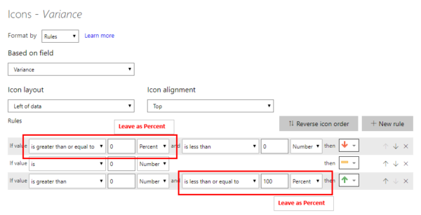
You are then presented with this screen:
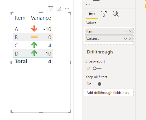
In order to apply simple negative / positive formatting you should set it up as follows:
The options presented in Excel and Power BI are confusing so hope this is helpful.

