
by Wyn Hopkins
Did you know about these hidden Power BI features?
It seems unfortunate that for such an awesome product there are a few user interface features that are very difficult to discover.
I have trained hundreds and hundreds of users in Power BI, and I get to experience people hitting these issues over and over again.
Power Query (5 tips)
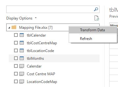
1. Connecting to a whole Excel workbook
When you connect to a workbook it’s obvious you can pull data from Tables or sheets as there are nice little check boxes.
What isn’t obvious is that you can Right-Click on the “folder” to then access all the file contents in one go. This can be great if you want to consolidate a whole bunch of sheets or tables in one go.
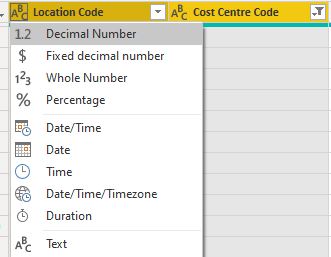
2. Multi column change Data Type by holding Ctrl or Shift
If you want to change multiple columns to a particular data type (say Text) then after multi selecting the columns using Ctrl or Shift you should keep your finger on Ctrl or Shift when you click the Data Type icon and all the columns will be changed in one hit.
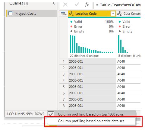
3. Data Profiling 1,000 rows
Power Query can show you the quality and distribution of the data you are importing but by default it’s only evaluating the first 1,000 rows. Toggle to the entire dataset by clicking on the wording at the bottom of the screen.
4. Add a description to a step via Properties
Add a description explaining why you did a certain thing. You’ll thank yourself in 3 months time.
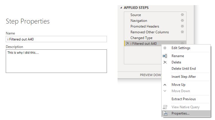
Note: I also add an i to my step name to flag the fact that there is more information
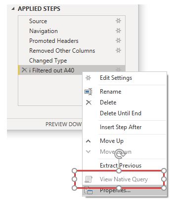
5. Checking for Query Folding
When connecting to a SQL Database (and a few other sources) Power Query can often get the database to do some of the hard work in terms of filtering etc before the data is pulled into Power Query. This is termed Query Folding. To check if this is happening you right click on an Applied Step and check to see if “View Native Query” is lit up.
In this case Native Query is greyed out so query folding isn’t happening (I’m actually getting the data from an Excel file in this image so it’s not surprising)
PBI Desktop (6 tips)
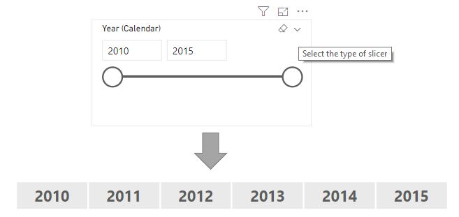
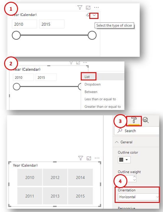
1. Slicers as Big Buttons
When you create a Slicer for Year you may get a slider or tiny check boxes but what you may want are some big buttons
It’s not intuitive how to get there (sometimes the tiny down arrow in step 1 isn’t even visible if your slicer is too shallow)
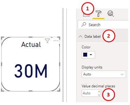
2. Decimal Places
Changing the decimals shown for a number inside a visual should be easy, and it is if you know how… The decimals box in step 3 sometimes looks “greyed out” and the spinners do nothing! However, just type a 2 in the box and away you go…
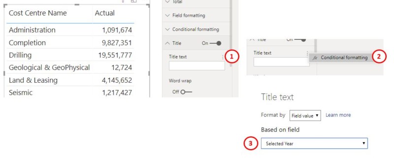
3. The mysterious case of the invisible conditional rules dots…
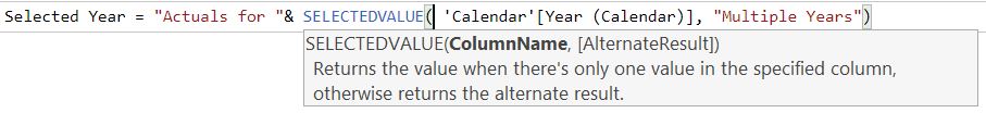
Did you know you can add dynamic titles to visuals? Did you know these 3 vertical dots are hidden everywhere, but they only show up when you hover over them!
This is the result
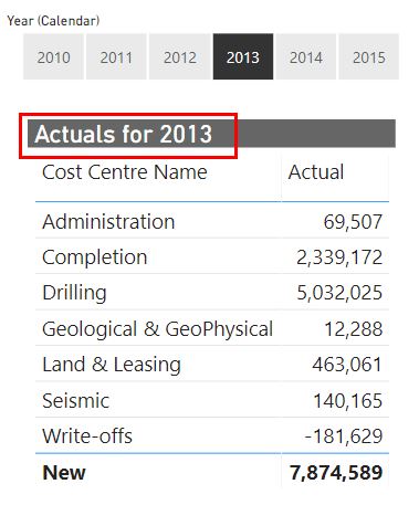
Note: this was my measure “Selected Year” used in step 3 above
These little dots are everywhere when you start looking and you can add dynamic labels, hyperlinks, and colour formatting to all sorts of things including buttons.
4. Custom Number and Date formatting
You can format your dates and numbers any way you like (almost) but NOT in the formatting area of the Modelling tab…
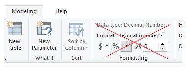
instead you do it via the Model (relationship view) tab
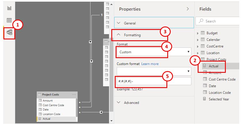
Note: You can click on the Learn More hyperlink (see just above the number 5 in my screenshot) to find out what formats are possible
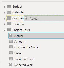
5. Dragging Measures
Also in this Model view (and only in this view) you can drag measures between tables
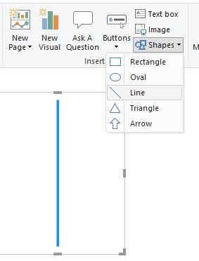
6. Drawing a horizontal line
A simple line can make a big difference to the read-ability of a report. It helps focus the user’s eyes on which direction they are meant to approach the report.
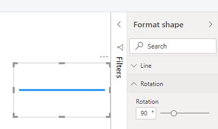
Drawing a vertical line is easy..
But knowing you have to go to the format panel and rotate it 90 degrees to get a horizontal line is not something new users easily discover themselves.
PowerBI.com (also referred to as “the service”)
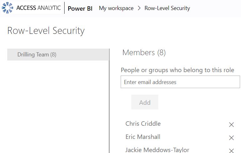
Testing Roles (Row Level Security) in PowerBI.com
This is possibly my “favourite”
Row Level security in Power BI is a feature where you can dynamically change what data a user can see based on their email login. You give these permissions to different roles and if the user who logs in is assigned to that role (by you) then they only see a restricted, filtered, view of the data. This is really powerful. e.g. the Drilling Team only get to see costs relating to the Drilling.
After you’ve added some Roles to Power BI desktop and publish your report it you can get to a screen like this..
Do you see the dots?
No?
They show up once you hover over them… 😲
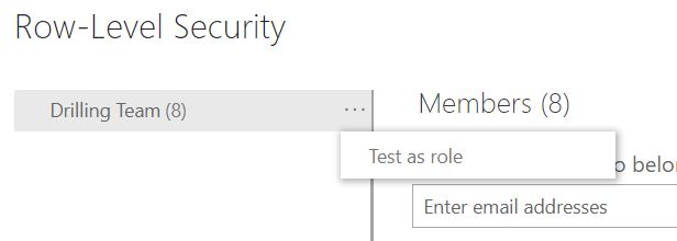
And there, on it’s own, is a Test as role option.
Summary
I love Power BI, it has amazingly powerful features. The speed of updates over the last 4 years or so has been crazy and full respect goes out to the folks working to deliver this world beating BI tool.
This article doesn’t flag any of the many awesome things Power BI does brilliantly. It’s really meant to be a helpful pointer to those items I find new users struggle with the most.
With the new Ribbon (released in preview recently) steps are clearly being made towards making Power BI features more discover-able, and I applaud this progress greatly.
If you’d like your team or colleagues to get some great training in Power BI and set them up for the best possible start then you’ll find details of our public courses and in-house training here.
We’ve trained way over 1,000 people from all types of organisations and departments in Australia and all around the world. We’re very proud of the fact that 85% of attendees giving feedback rate the courses a 9 or 10 out of 10, and don’t worry, the remaining 15% gave us a rating of 8 !


